


Body Section: The Meat of the Message
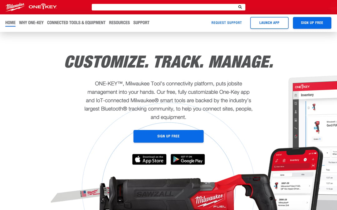
If you think of the middle section of the homepage as the body section of an essay, it focuses on expanding three key points (expounding on the “Customize. Track. Manage.” header promise to explain what we mean):
- Customize: In the ‘Customize’ section, we’ve incorporated a subhead we’re quite proud of: “Customize your connected experience.” We believe the One-Key platform provides end users with whatever experience they need it to be. For example, some users may want to get as granular as setting a division, while others may just want to use it to store all their paperwork. How you use One-Key is up to you, and you can customize the experience to your needs, your growing business, or even use it to optimize the work you do when you take advantage of One-Key customization features on compatible smart tools.
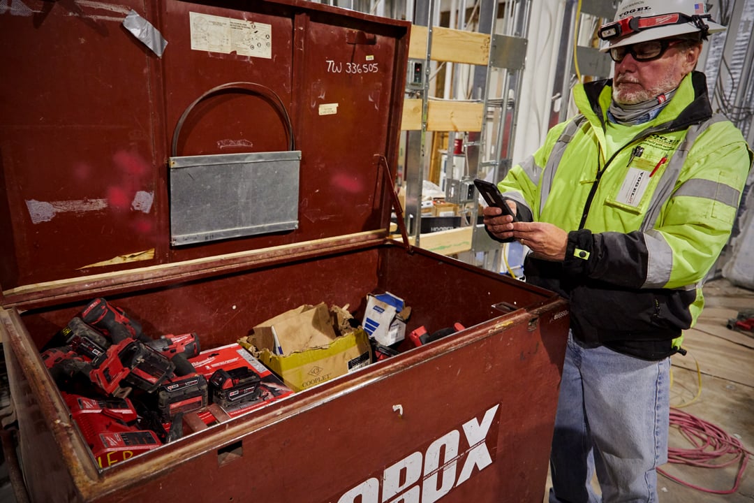
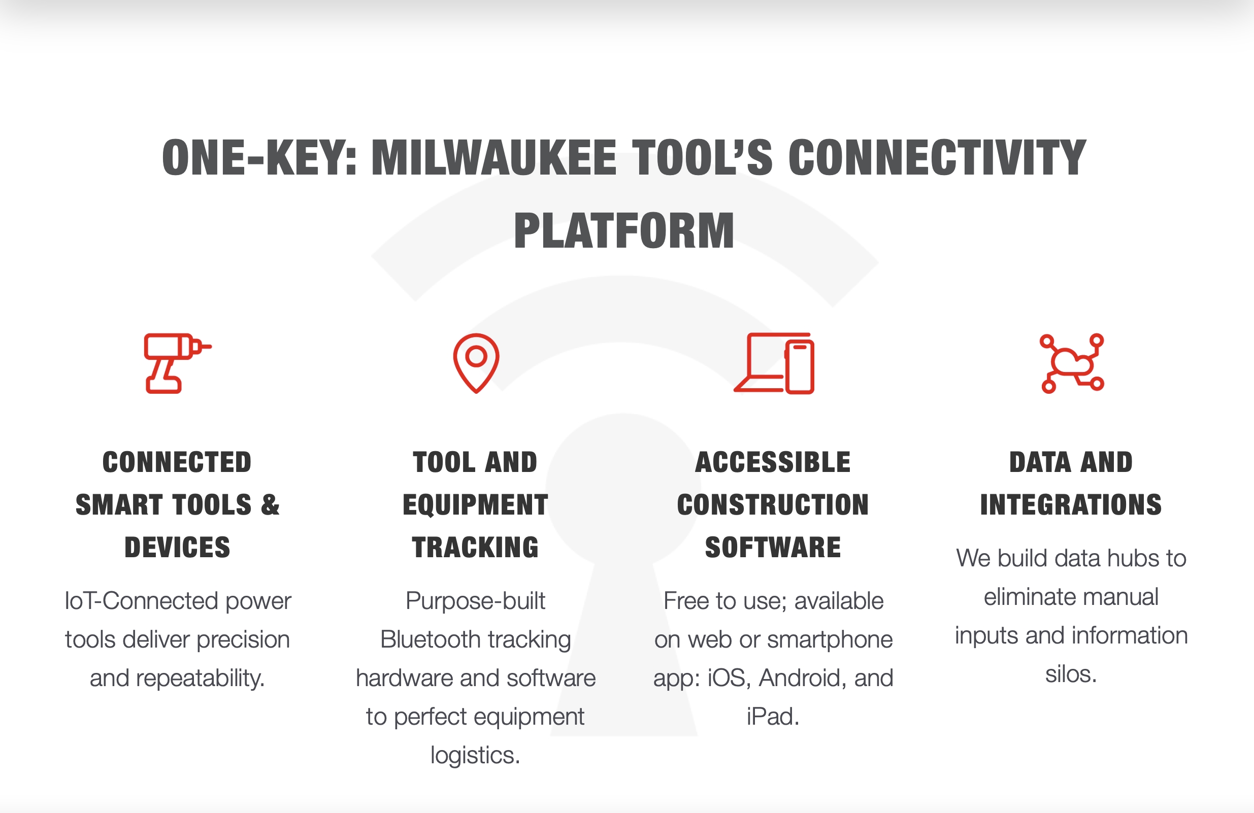
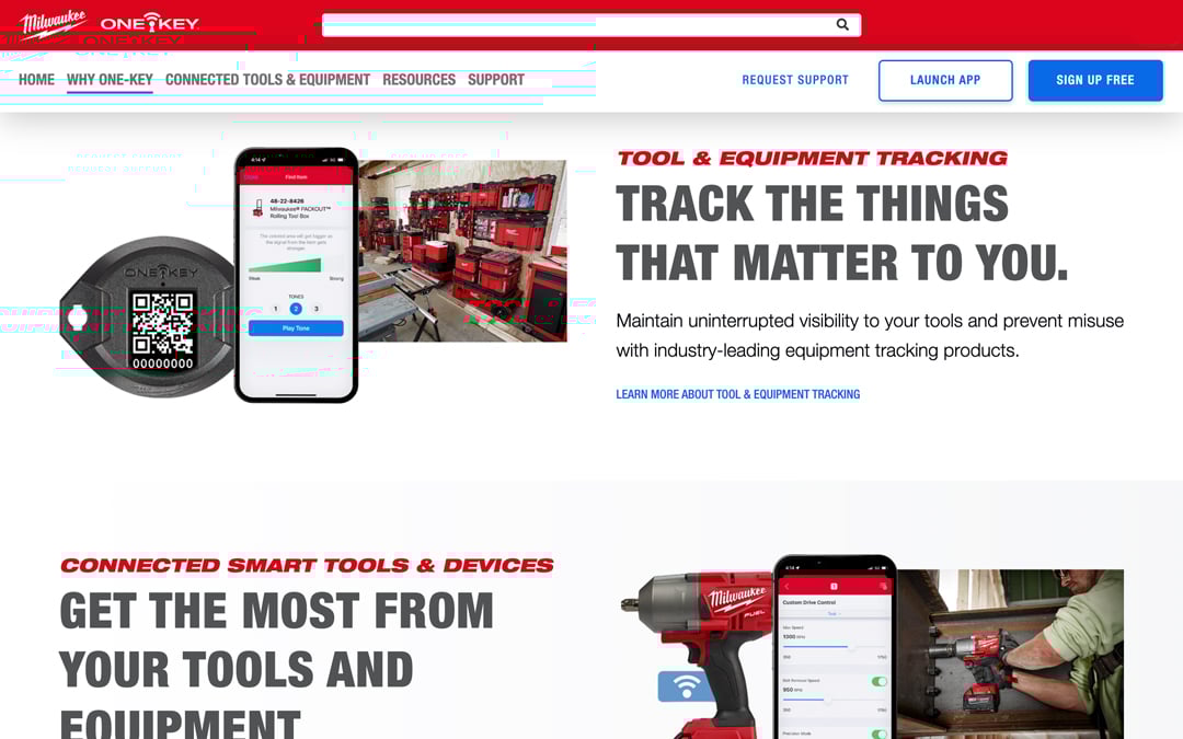
- Track: The “Track” section was a crucial part for us to expound on when seeking to solve the misconceptions many users have with One-Key tracking. To do this, we’ve added an explainer section, reiterating that One-Key supports the industry’s largest Bluetooth community, and then explaining what that means: We explain that our Bluetooth network helps end users crowdsource equipment locating, then we explain 1) compatible smart tools have Bluetooth functionality built into them, 2) these Bluetooth modules allow for end users to connect to their tools, and 3) end users can add Bluetooth tracking functionality to any item by adding a One-Key Bluetooth tracking tag to that otherwise untracked item. Additionally, we’ve incorporated a support article we’ve written, which discusses how Bluetooth tracking works, which end users can read to get a deeper understanding than the high-level overview we’ve offered here. Below this explainer section, we’ve also incorporated a section to show the tool tracking hardware we currently offer (e.g., Bluetooth tracking tags and asset ID tags).
- Manage: Finally, the “Manage” section of the page explains how One-Key can be used to streamline construction inventory and project management by offering a fully customizable experience, multi-user permissioning to accommodate teams of all sizes, and data connectivity, integrations, and pilot programs to empower interdisciplinary collaboration.
Closing Section
The final section of the website includes a final wrap-up of what has been discussed, encouraging users to “build a more connected jobsite” by signing up or downloading the app from the App Store or Google Play, followed by user reviews, and an interactive product lineup section that can filter by product type.
The homepage redesign was a massive undertaking which involved significant reworking and reorganization, as is evidenced above by how much time it took to explain everything that has been changed.
Now that we’ve discussed the homepage, what else has been done?
Enhanced Navigation and Wayfinding
The One-Key website has grown tremendously over the last three and a half years, but despite this growth, few users have known the full breadth of this site.
We’ve helped to bring this breadth to the forefront by incorporating dropdown menus in our navigation that help clarify just how far the rabbit hole goes, as it were.
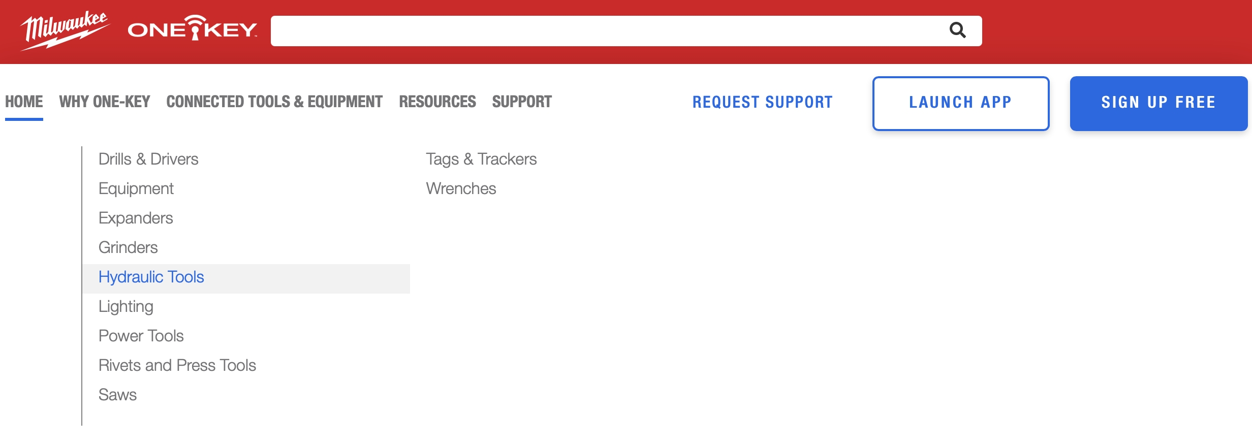
For example, for “Connected Tools & Equipment,” rather than just having a stationary button that users press that directs them to a full listing of our products, there’s now also a dropdown menu that shows categories, which can be helpful to illustrate at a high-level the breadth of product line we offer with One-Key compatibility.
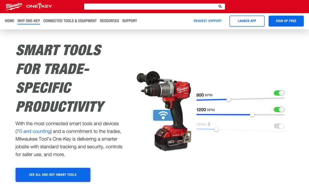
“Why One-Key?” Landing Page and Redefined “Why One-Key?” Pages
The next level down in the website structure, “Why One-Key?”—where we explain on a deeper level not just what One-Key is, but why users would choose to use it—has also been refreshed.
“Why One-Key?” Landing Page
To start, we’ve added a landing page for this section of the website, which, similar to what the homepage does for the whole website, we discuss at a high level what will be discussed in each of these subpages.
Prior to this, the “Why One-Key?” pages were all served up via an interactive menu, where individual icons “e.g., ‘Inventory Management’” could be clicked and the page would serve up the contents of those pages. While this earlier iteration provided modern website functionality, it didn’t offer a clear pathway from the high-level information of a simple landing page to the more in-depth content each subpage would discuss. As a result, some users weren’t even aware that the buttons were clickable.
To fix this, we’ve created a clear path:
“Why One-Key?” --> “Why One-Key?” pages (Accessible Construction Software; Tool and Equipment Tracking; Connected Smart Tools & Devices; Data & Integrations)
“Why One-Key?” Pages
After reviewing our user feedback and collective soul searching, we determined the old version of the website to have too many pages than were necessary.
Aligning with what our One-Key marketing leadership team has determined to be priorities, we’ve cut down what once were 5 pages to now 4 pages.
Old “Why One-Key?” pages:- Crew Management
- Places Management
- Tool Tracking
- Digital Inventory
- Connected Tools
The content of the two former pages, “Crew Management” and “Places Management,” has been reworked and incorporated throughout the new version of the site. We felt that these pages, while their content is true, don’t necessitate individual pages, but rather, their content better serves a leaner site structure.
New “Why One-Key pages:
- Accessible Construction Software
- Tool & Equipment Tracking
- Connected Smart Tools & Devices
- Data & Integrations
Redesigned Product Page
The One-Key Connected Tools & Equipment page has been radically redesigned.
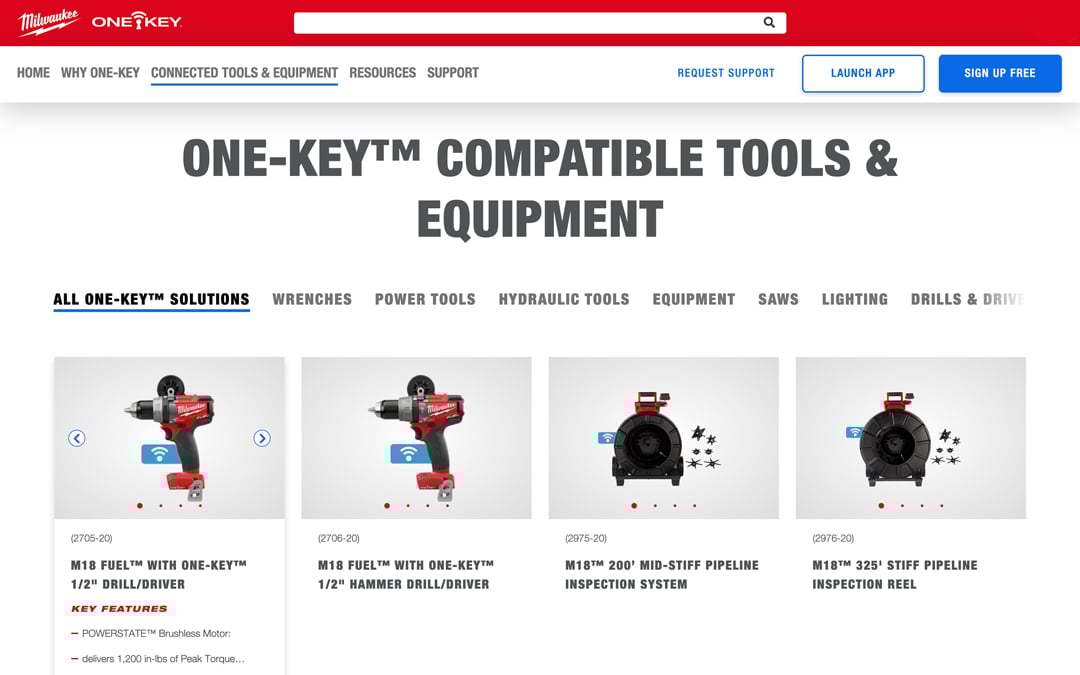
We wanted to figure out a better way to display everything a user might need to know in the most visually concise way.
Here are some of the Cliff’s notes:
- Scroll bar with product categories: Part of what we want to make known to end users is that we offer the widest range of cordless power tools in the industry, offering a product across the whole lifecycle of a project—meaning, whatever the trade and whatever the project, there’s a solution on one of our cordless platforms (M12™, M18™, MX FUEL™). This is also certainly the case for One-Key compatibility, as we offer the widest range of connected smart tools and devices of any manufacturer. To make the sheer breadth of line apparent, we’ve incorporated a scroll bar that lets users easily navigate between product categories (e.g., wrenches, power tools, hydraulic tools, equipment, lighting, etc.) and drill down into each category to find a solution.
- Redesigned product cards: We’ve brought product details to the forefront of each product card to provide end users high-level information on each product. When you hover over a product card, key feature bullet points will populate, and you can scroll through an image carousel, all from within that product’s card. We’ve also incorporated social share buttons, just in case you want to share a specific product with a coworker in your social network. If you want to learn more, you can tap the card or click “Product Details” to redirected to the full product page on MilwaukeeTool.com.
Redesigned Blog Page
A similar problem we face with our wide product offerings and making this breadth of line known to users is making the breadth of blog content and resources that have been covered as our content team pushes content out at a similar frequency to our product teams releasing new products.
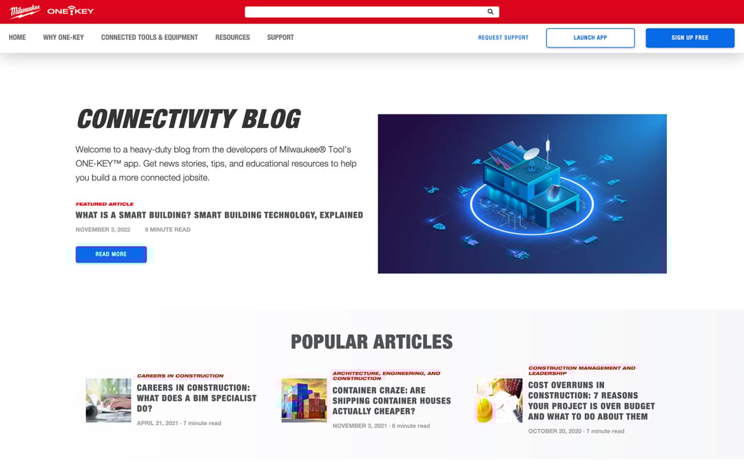
To solve this, we’ve refreshed our blog landing page with clearer organization:
- Search Bar: We’ve added a search bar at the top of the page, allowing you to search by keyword.
- Popular articles: These are our most read articles of all time, to date.
- Articles by category: Similar to our product page, we’ve incorporated a category scroll bar so you can find articles in a specific category of interest, such as industry news stories we’ve covered, or articles related to contech, sustainable construction, and so forth.
- Individual categories: Below the category slider that offers more personalization to your search filters, we’ve served up content by specific content categories (e.g., Construction Management And Leadership-related articles, Construction Technology-related articles, and Industry News-related articles.
Redesigned for a Simpler Experience and Better Education
We realized that we could do a better job educating on the One-Key platform.
This redesign represents a significant step toward educating about the One-Key connectivity platform with user needs front and center.
We will continue to test, audit, and make incremental improvements based on feedback from users.