 We’ve recently updated how we approach creating support articles on ONE-KEY™ Support and wanted to inform you of these changes.
Background
Our app is supported on Android, iOS, and web-based devices. As such, we’re committed to providing support across all 3 platforms, ensuring that, whichever device you happen to be using, you’ll be able to access the support you need.
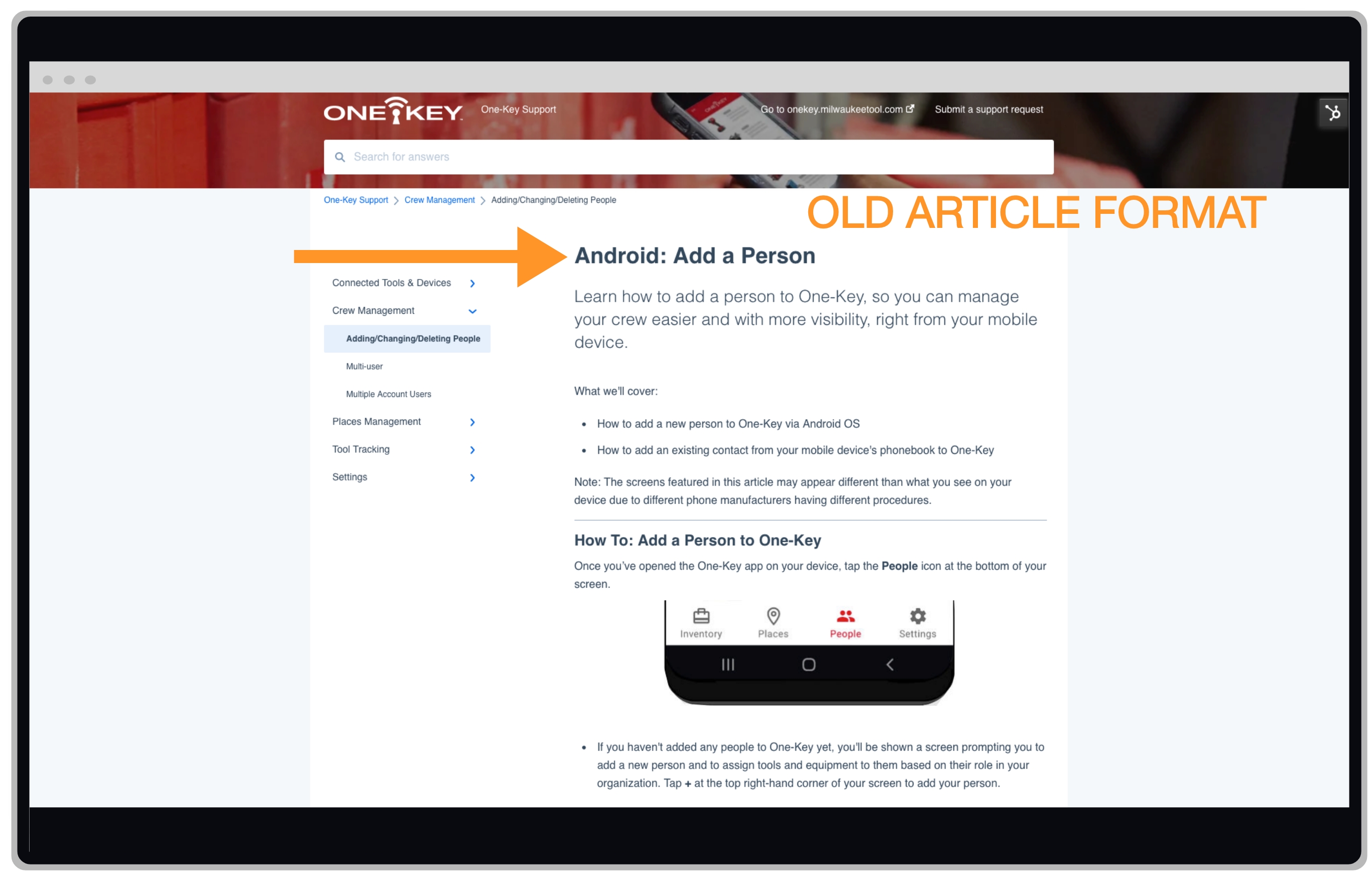
Our previous process, you might recall, entailed adding a platform prefix to the title of each article. Ex: “Android: Add a Person” The below screenshot illustrates what these articles used to look like.

That said, our knowledge base is constantly evolving as we add new features, and organization of these articles needed to be addressed, as we feared that our content library would quickly become cumbersome to navigate. For example, when visiting many category pages, you’d have to click “See more” in order for all the articles under some subcategories to display; what’s worse, in some instances, when fully expanded, the sheer quantity of articles under each of these subsections made it difficult to find the specific article that users were looking for, almost like trying to find a needle in a haystack.
Solution
We came up with a new process to streamline how we document features in the app in support articles. Rather than creating a new article for every feature on every platform—in effect adding 3 new articles every time a new feature is released—we have instead created a process for documenting each platform in the same article. The platforms' prefixes have also been removed, as in, "Assign a Person."
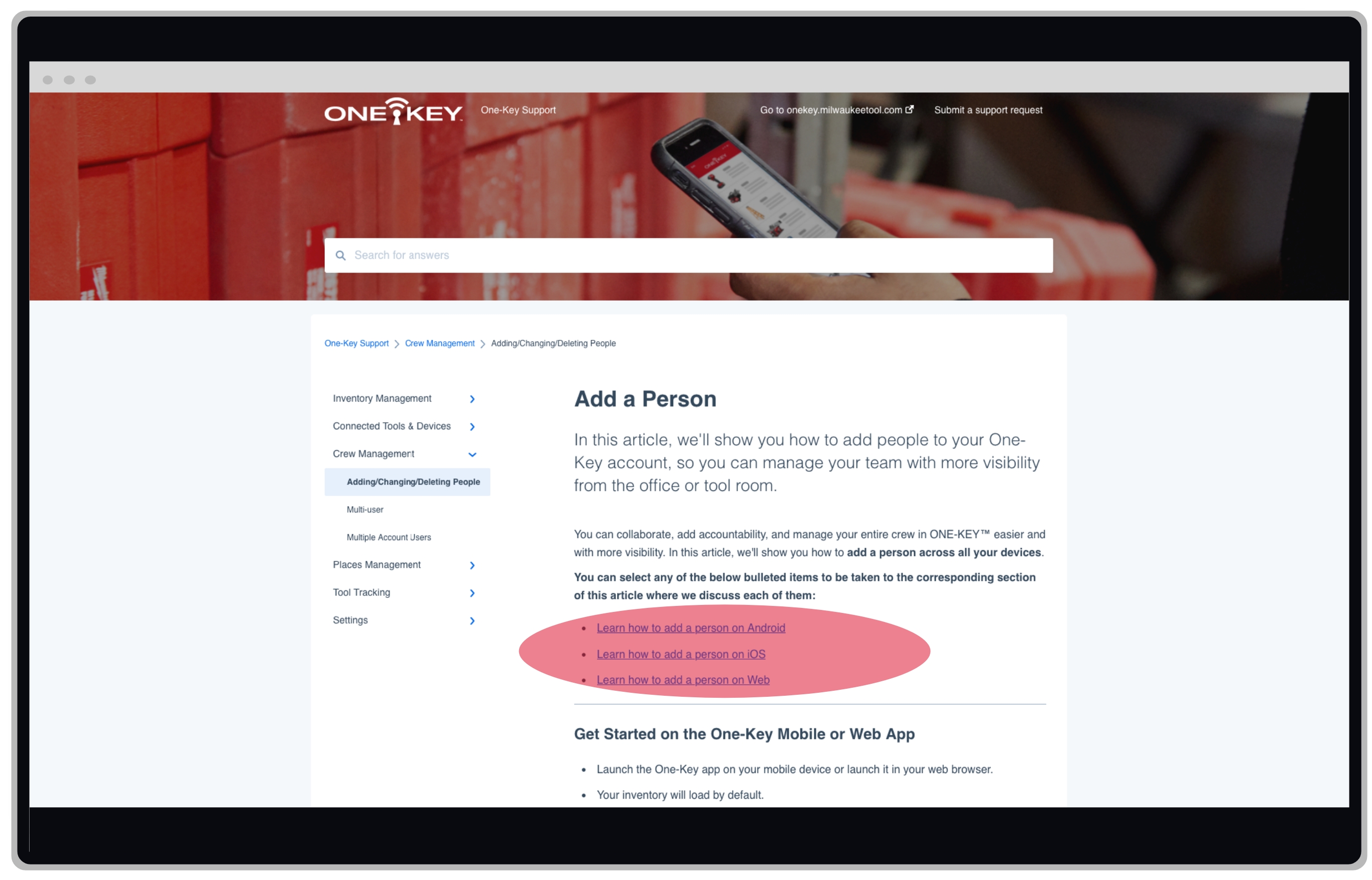
1. Article Table of Contents: You’ll notice when you land on most articles now, near the top of the article at the end of the article’s introduction, there is a bolded sentence that reads “You can select any of the below bulleted items to be taken to the corresponding section of this article where we discuss each of them:”. The bullets that follow this disclaimer act as a sort of interactive “table of contents.” Find the platform you want to be directed to, such as Android, and you’ll be redirected down the page to the corresponding section where that platform-specific support is documented.

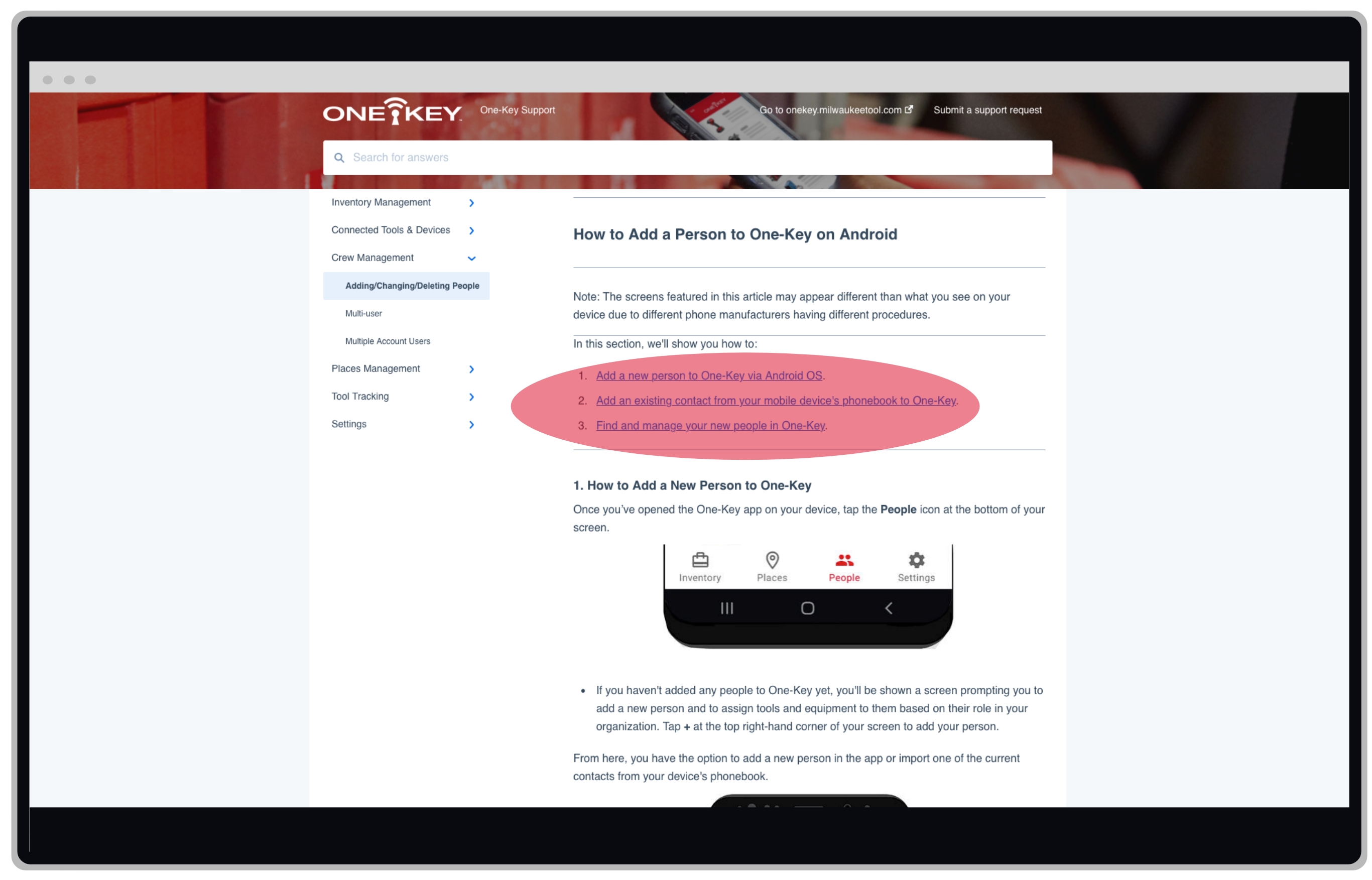
2. Platform-Specific Table of Contents: Additionally, in articles that contain more detailed instructions, those platform subsections may contain their own interactive mini-tables-of-contents with numbered bullets. When you click each of these, you’ll be dragged further down within the platform section where its subsection is addressed.

3. Back-to-Top and Back-to-Top-of-Section Links: To help you navigate and not get lost within an article, we’ve also added “Back to Top” and “Back to Top of Section” links at the bottom of each platform section and subsection that will, respectively, take you back to the top of the page, or to the top of that platform’s section of the article.

The new process has been deployed across our knowledge base, with few exceptions: For example, where features exist only on one platform, like web reporting, in these instances, the old format has been retained. However, for most articles, we were able to apply this new process, resulting in cutting down the overall quantity of articles in the knowledge base by a considerable measure and making it far easier to find what you’re looking for.